01 / THE Features
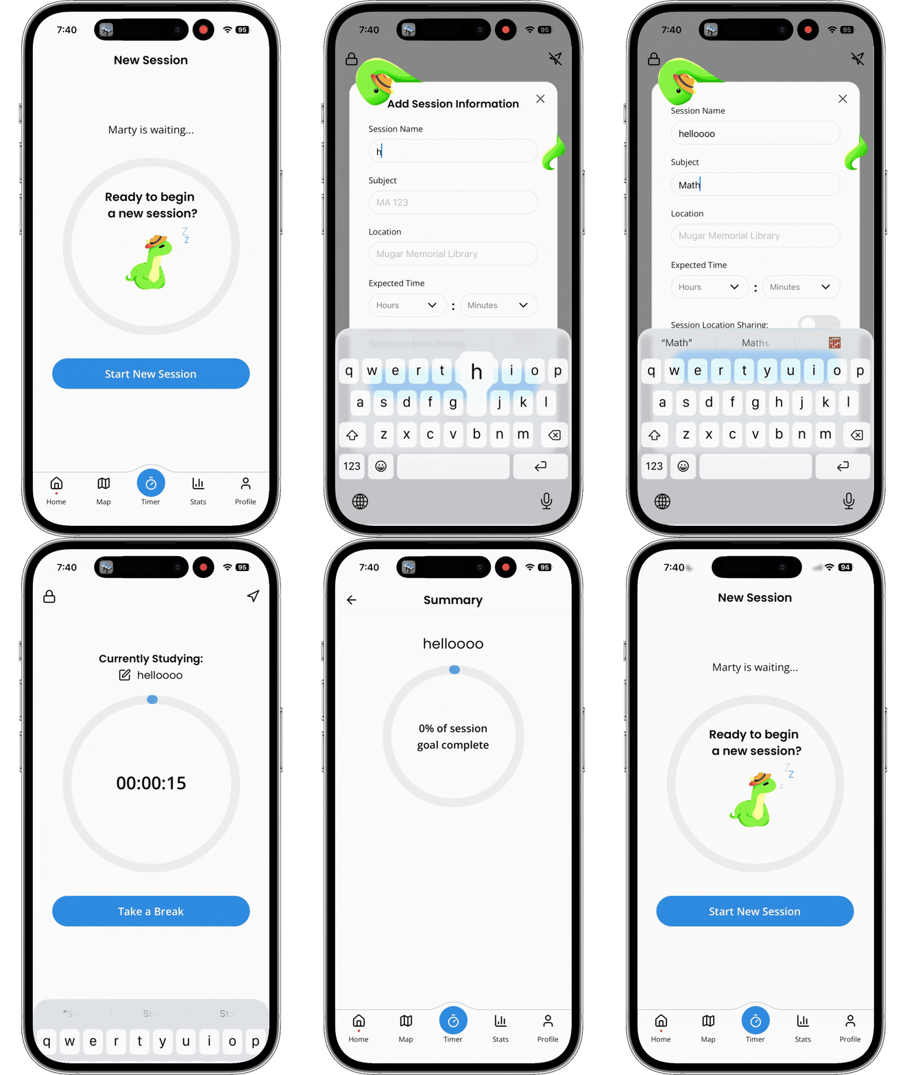
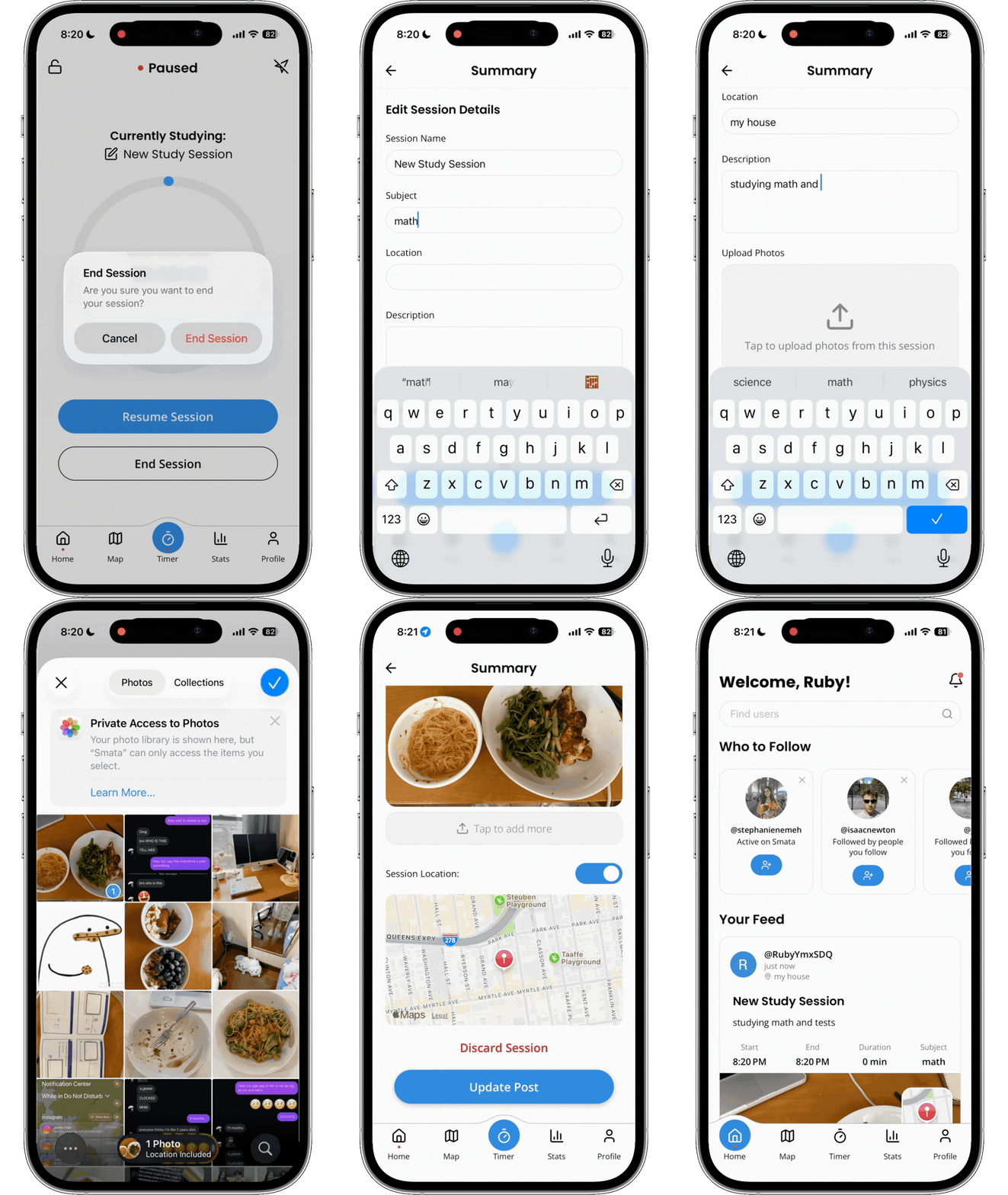
01 — Start and track a study session
The timer is one of Smata's core interactions.
Students can begin a study session, track their study time, and record the activity as part of their broader progress. Throughout the study flow, Marty is integrated into key screens to make the experience feel more encouraging, playful, and supportive rather than purely functional.
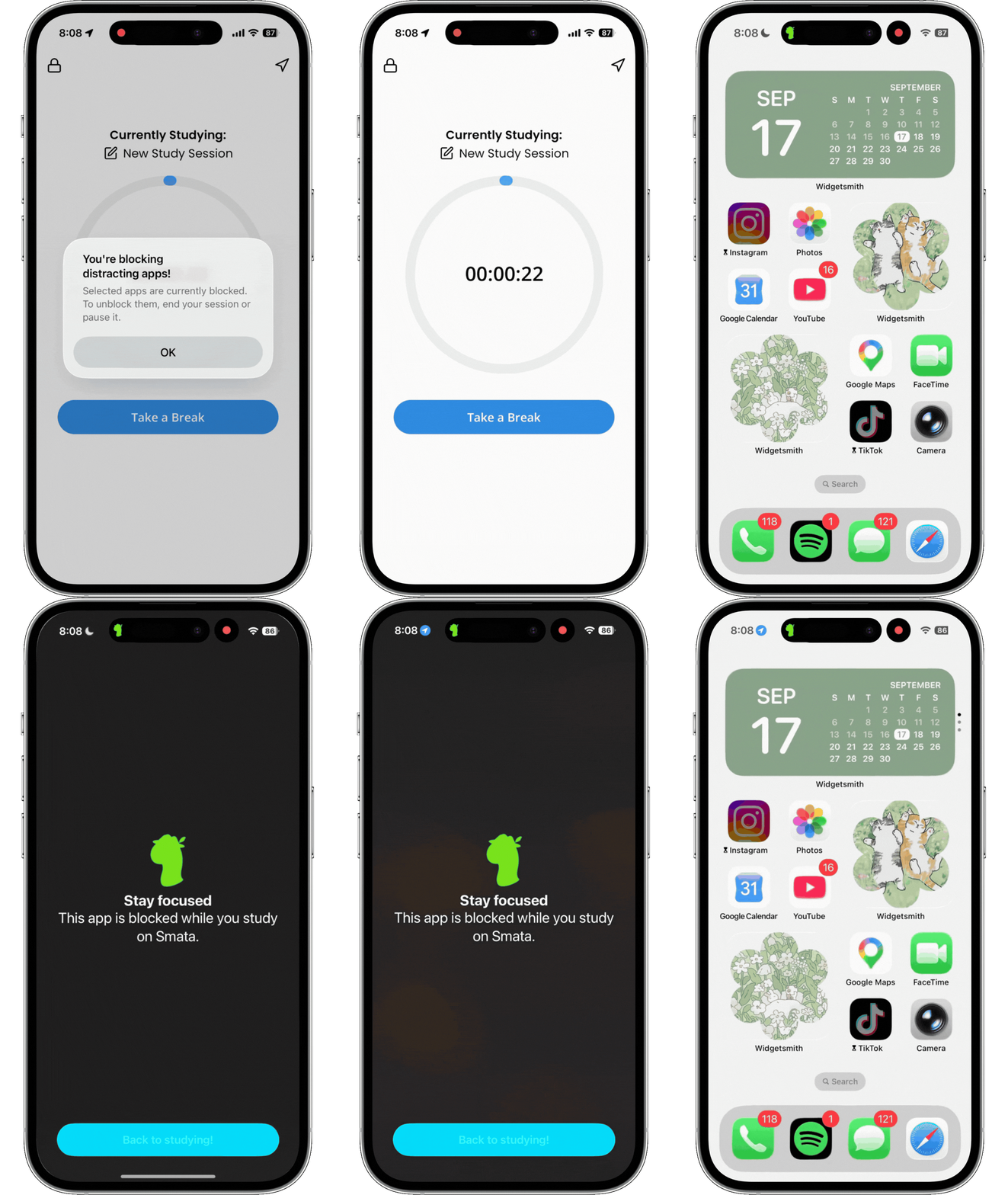
02 — Protect focus with Lockdown Mode
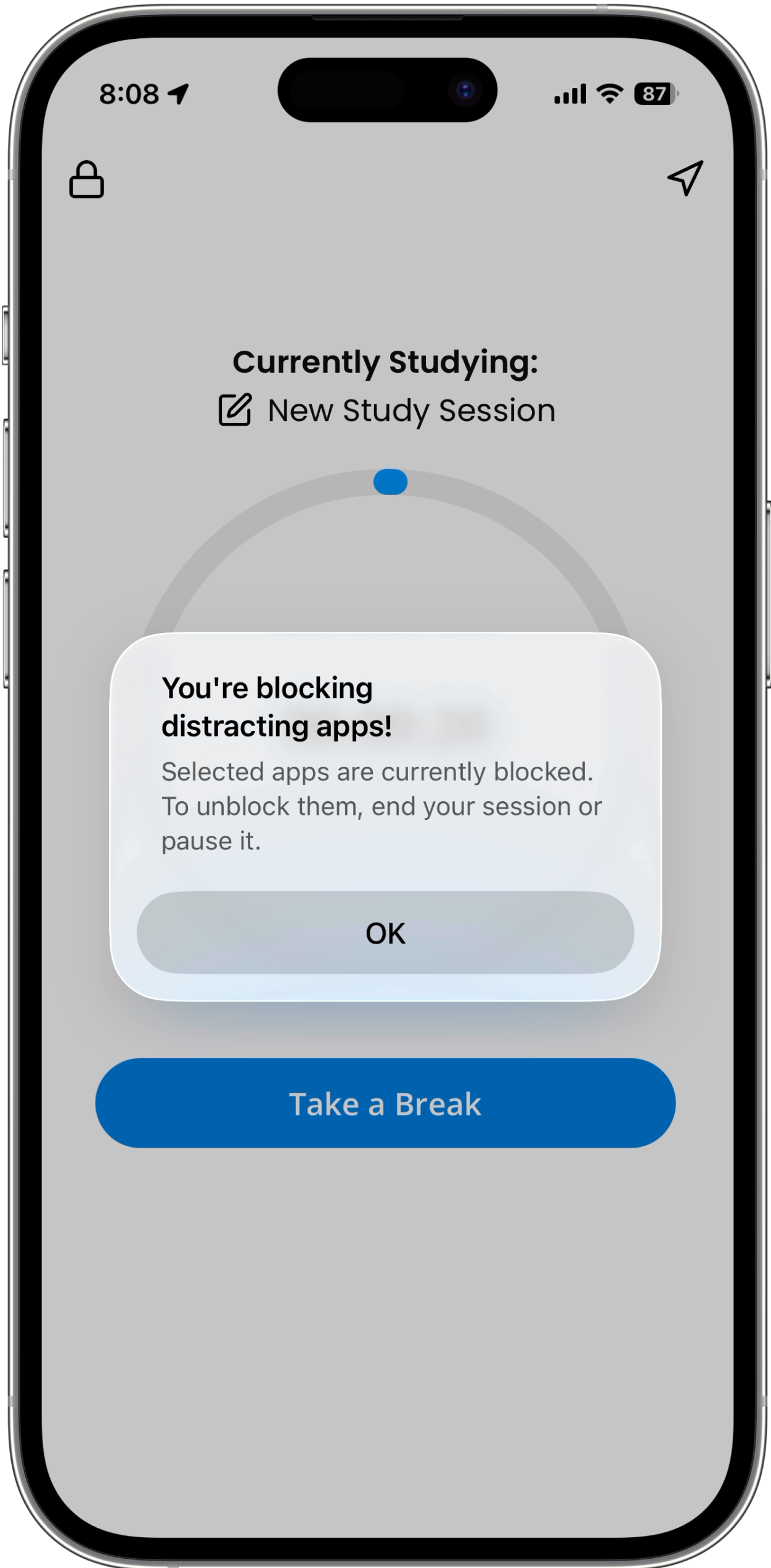
Choose distracting apps to block while you study and keep your attention on the work in front of you.
Lockdown Mode supports Smata's goal of encouraging healthier study habits instead of competing for more screen time.
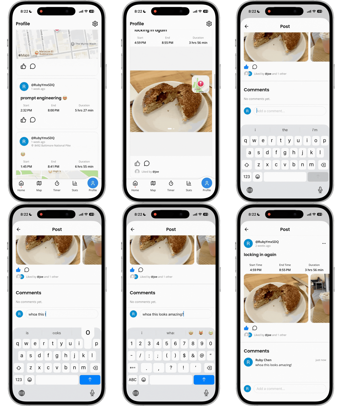
03 — Turn study activity into something social
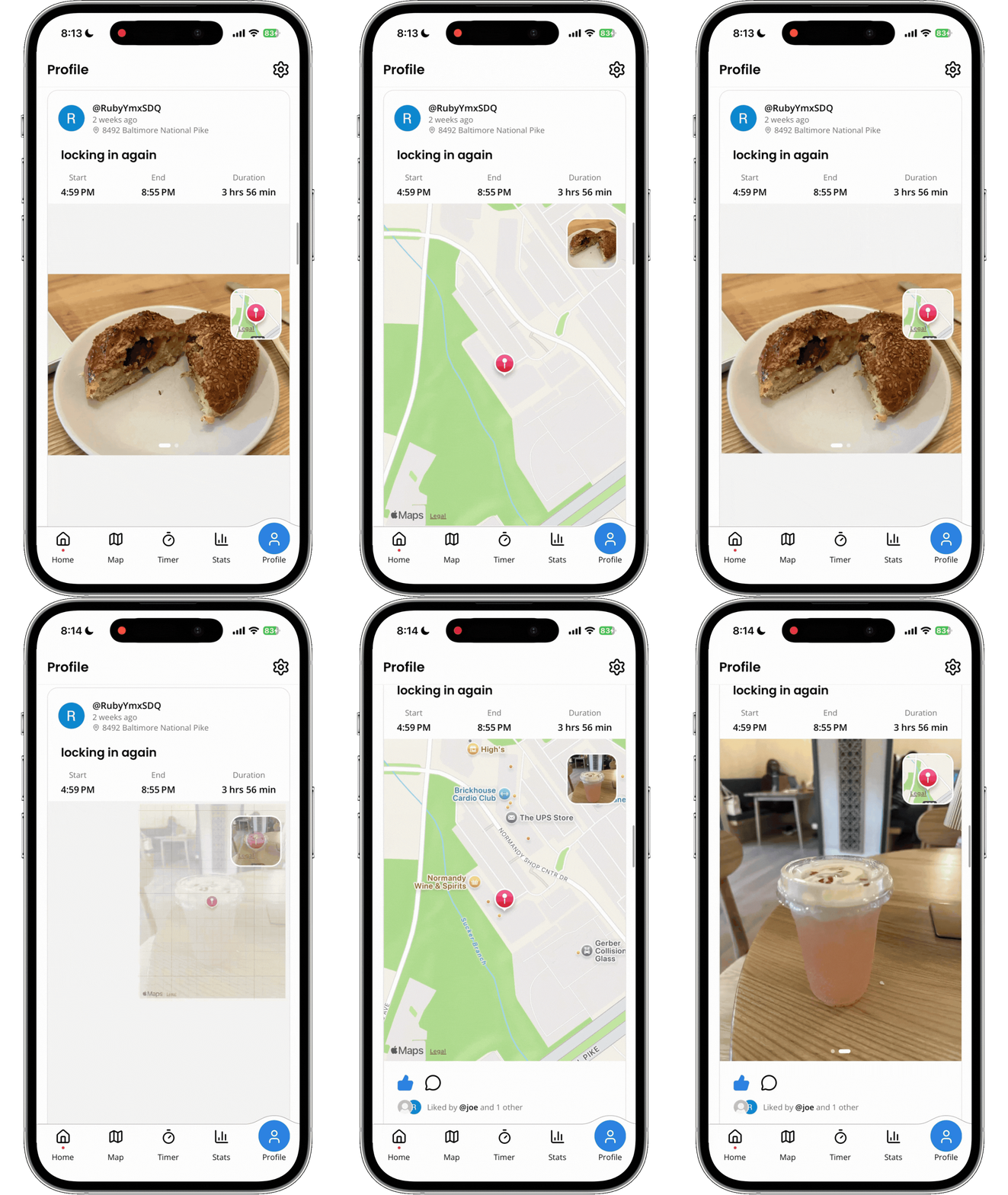
After finishing a session, users can turn their progress into a post by adding photos, captions, titles, and location details.
The feed puts more emphasis on the people and moments behind studying, making progress something friends can celebrate together.
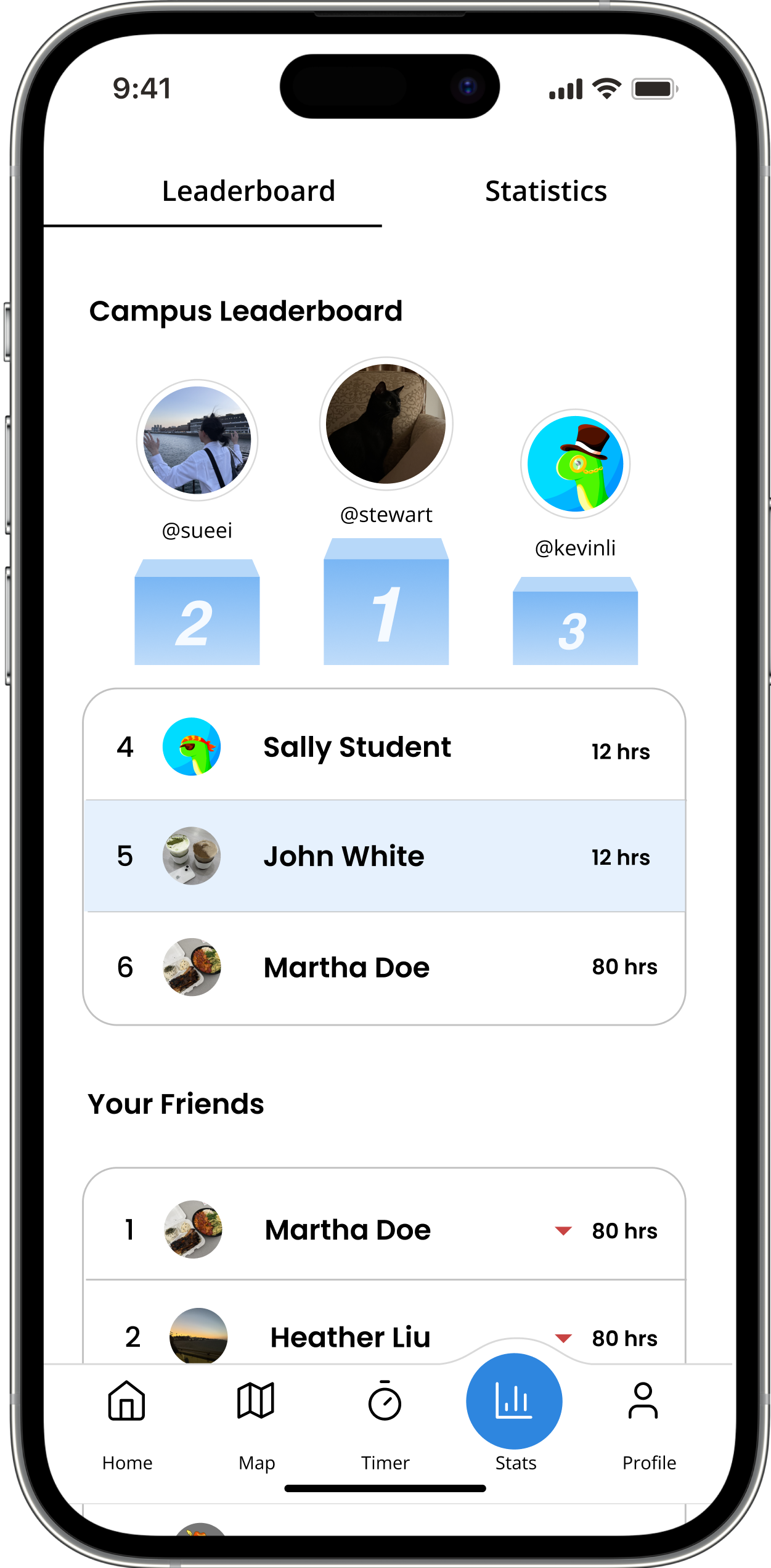
04 — Make progress with a little competition
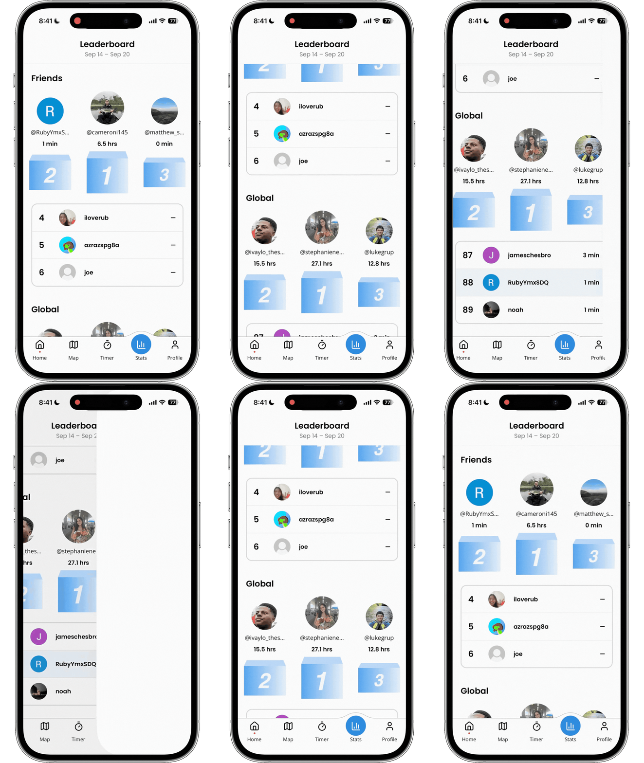
Compare your study activity with friends through Smata's leaderboard.
The leaderboard lets users compare study activity with friends, introducing a layer of friendly competition and accountability. Future versions are intended to extend this concept to broader communities such as campuses.
05 — Creating a foundation for location-based studying
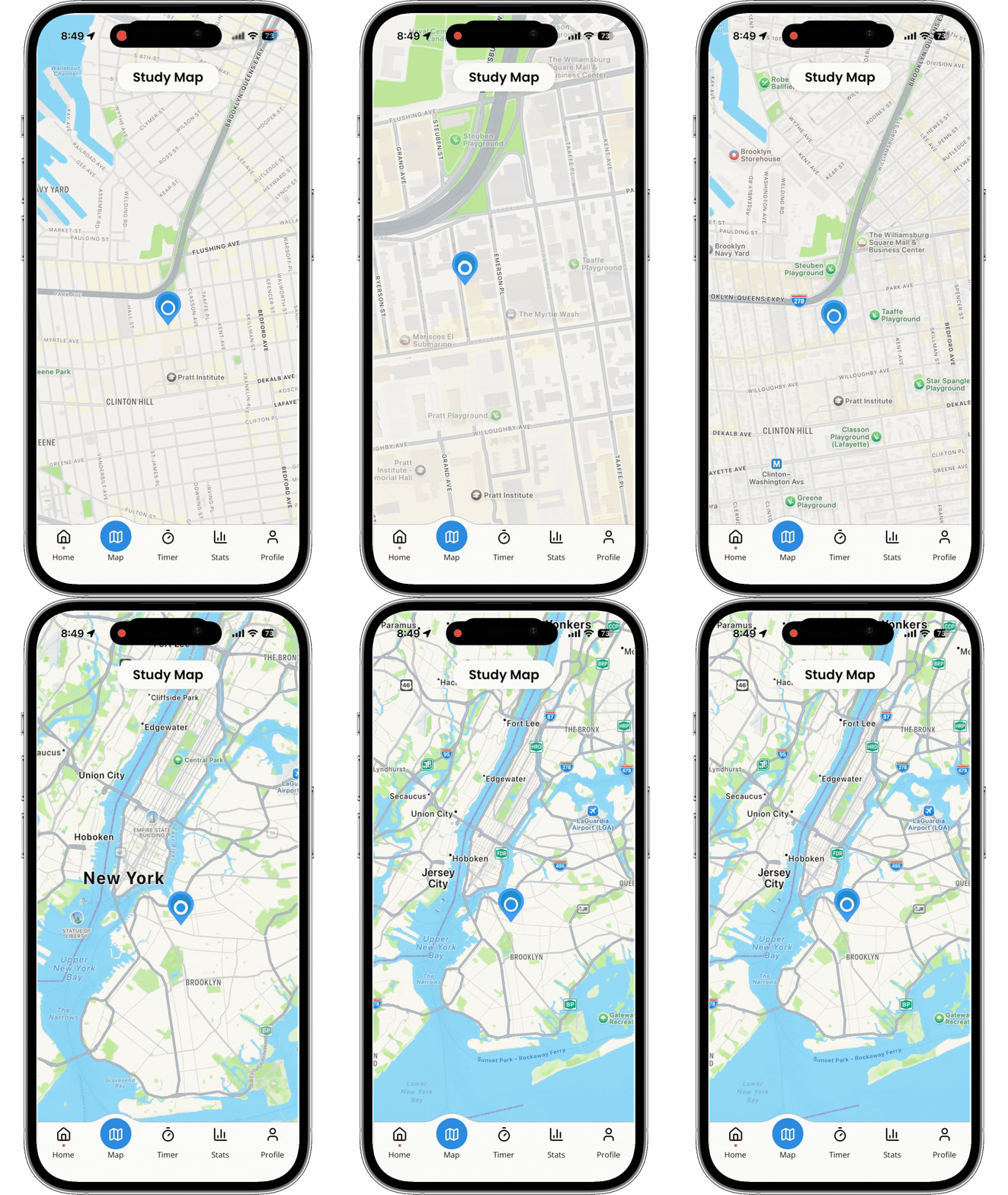
Use the map to see where friends are studying and discover opportunities to study together in-person.
Location sharing is intended to remain optional, with privacy controls giving users more control over when and with whom their location is visible.
The UI went through low, mid, and high-fidelity stages, but the most critical challenges were not addressed by simply polishing the product. Throughout the project, we continuously refined key areas of the experience to reduce friction, strengthen the social experience, and stay aligned with Smata's core mission: helping students build productive study habits.
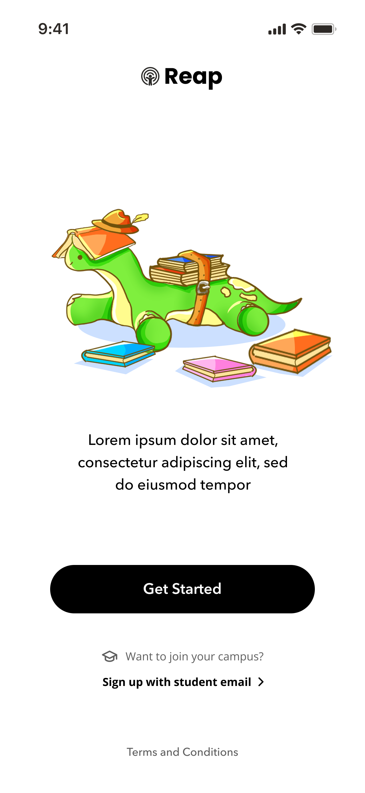
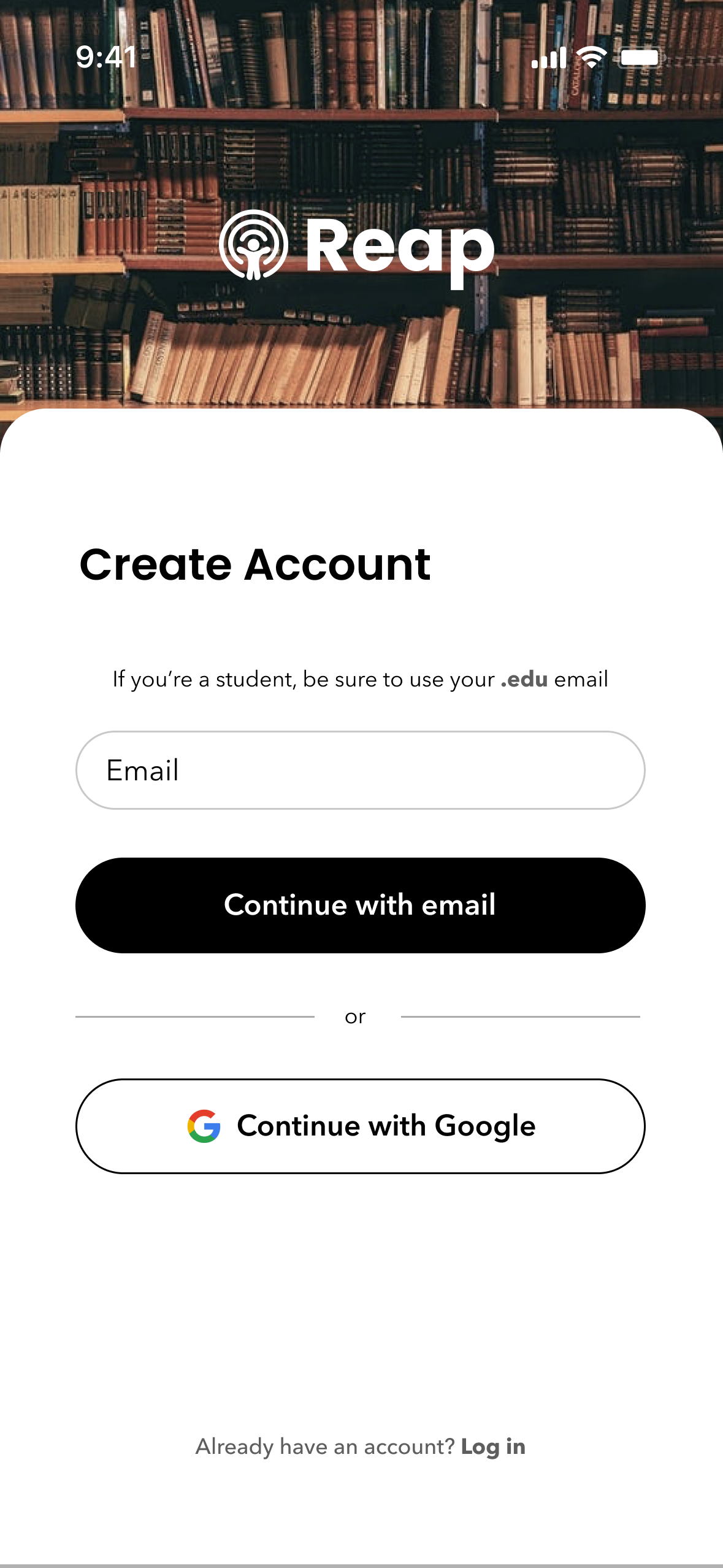
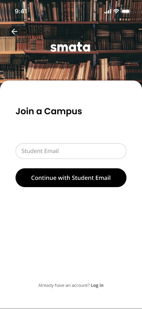
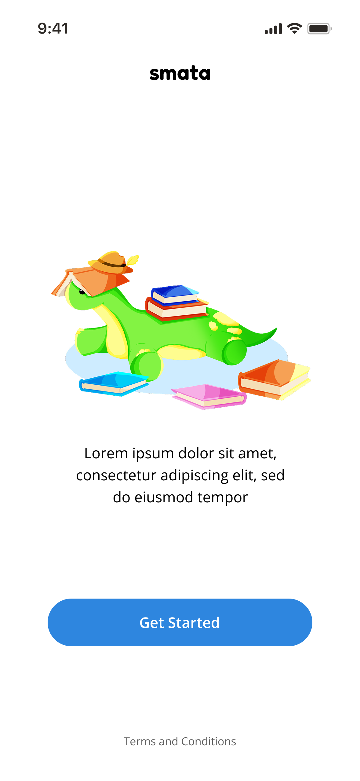
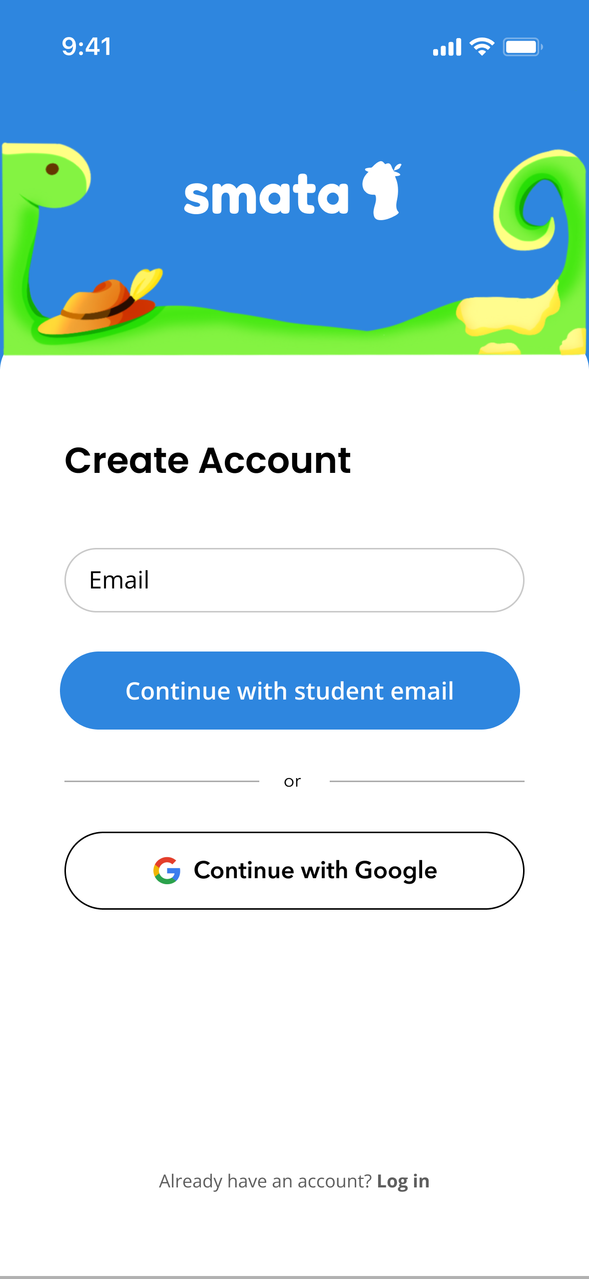
01Reducing friction at signup
We simplified the onboarding flow to reduce friction during signup and to identify whether a user was a student. This will help us connect them to their Campus Leaderboard.
What changed
We added a clearer way for users to sign up with student status. We also made the onboarding more visually appealing.
Why
The goal was to reduce friction to get as many users on for testing and to enforce the branding more.
02Shifting attention from location to people
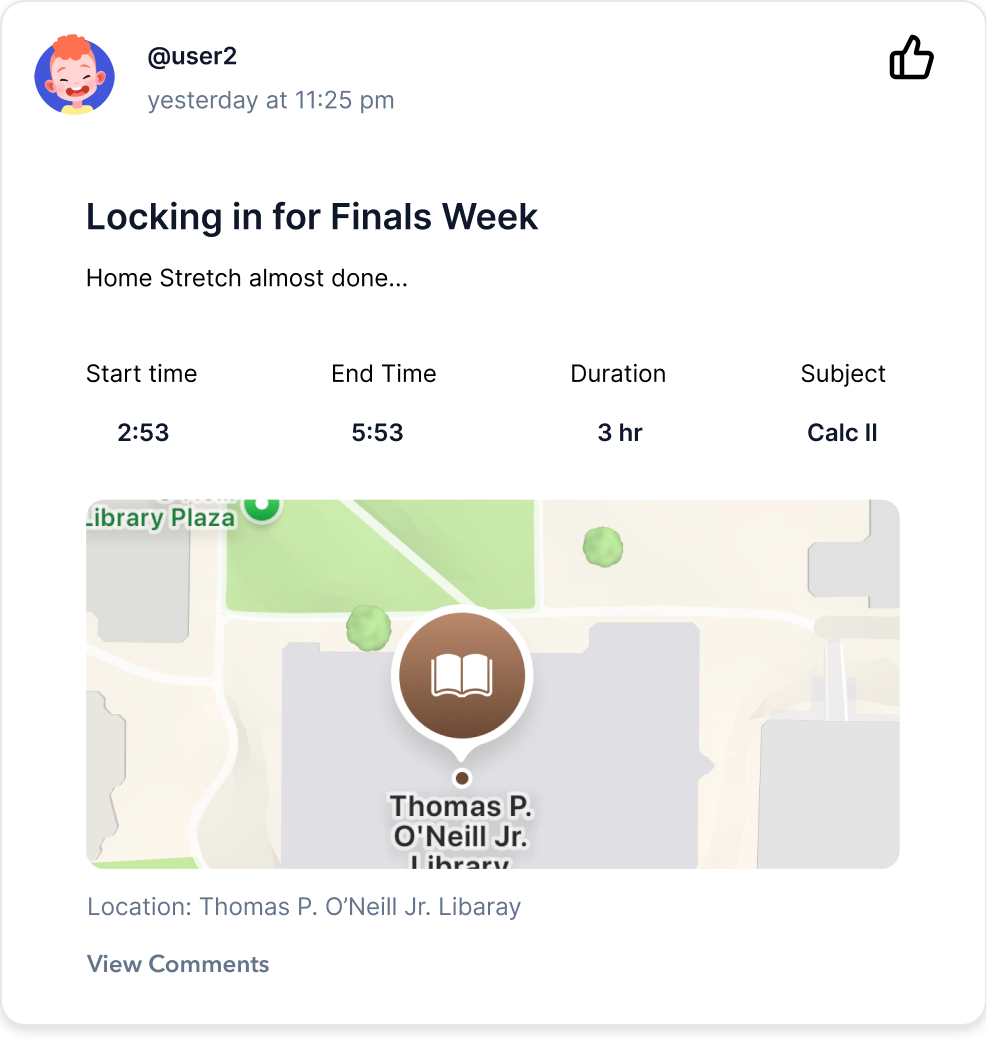
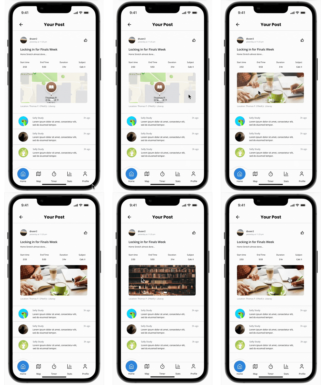
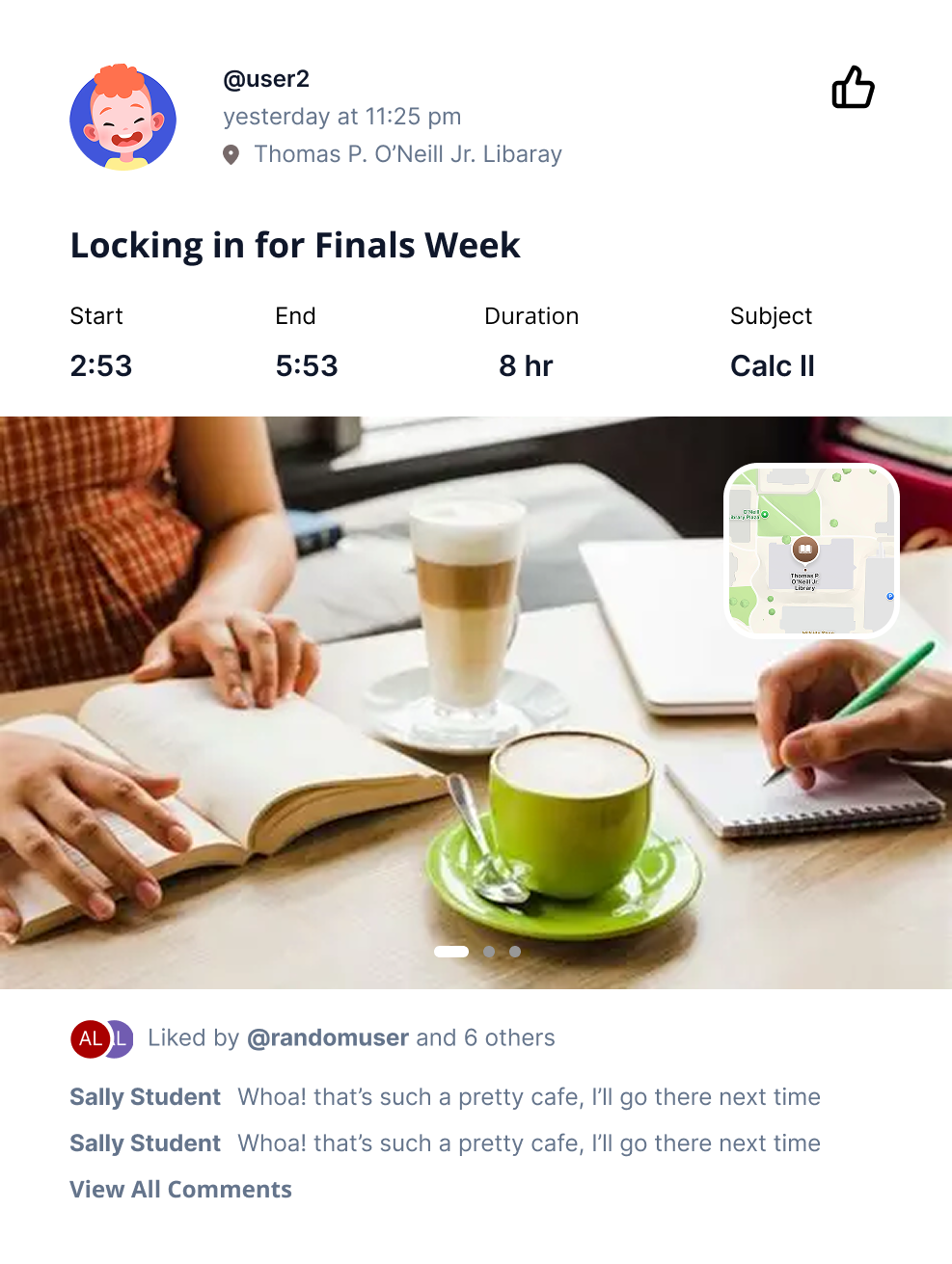
We redesigned the feed card to prioritize user photos and the shared study moment instead of the map location
What changed
The photo became the dominant visual element within the feed card element. The map location information became a smaller visual component of the card.
Why
We felt that the documentation of the social aspect should be the primary focus of each post. Since Smata is centered around who students are studying with and the moments they share, we made photos more prominent and moved the map into a supporting role.
Approximately 50 users began testing Smata before launch
We collected about 50 users began testing Smata before launch and asked them to provide feedback so we could get a meaningful look at how people were responding to the product in use.
I reviewed feedback directly from testers as well as feedback collected by the founders. I noticed several themes emerging:
Activation and social discovery
Some testers wanted an easier way to find or invite friends immediately after creating an account.
Starting a session
Some feedback suggested that beginning a study session could be made more visually prominent and easier to discover.
Lockdown Mode
Testers responded positively to this feature while also identifying opportunities around permission clarity, blocked-app messaging, and returning users to their active timer.
Motivation and progress
Users also suggested deeper reward systems, streaks, achievements, character-based encouragement, and additional ways to visualize progress.
Map and community
Feedback suggested that the users saw potential for the map to better support nearby studying and community discovery.
Real user feedback
A small sample of feedback received during beta testing.
“I had to dig around to find how to invite my friends. It would be great to see that right after signing up!”
3 upvotes
“Starting a session works, but the start button is kind of small. I almost missed it the first few times.”
2 upvotes
“Lockdown Mode is super helpful. A couple things though - the permission prompt was confusing, and it was not clear why apps were blocked. Also easy way back to my timer if I exit the app?”
4 upvotes
“Love the concept! More rewards would be awesome - streaks, achievements, maybe even leveling up Marty or something.”
2 upvotes
Emerging beta themes:
- 1. Reduce activation friction
- 2. Make study actions easier to discover
- 3. Strengthen social discovery
- 4. Deepen motivation and progress
Retrospective grouping of early beta feedback
At this stage, Smata has moved from an early visual concept into a working product with a cohesive interface and design system. The social feed, Lockdown Mode, friend leaderboard, and core study experience are implemented, while broader location sharing, campus-based competition, and monetization features remain future opportunities. The next phase will focus on synthesizing beta feedback and using real product usage to guide the next round of design decisions.
Since joining Smata in November 2025, I have helped move the product from an early visual concept into a cohesive interface and design system now being used in the working beta.
Today: ~50 users have participated in beta testing. The redesigned product has progressed into its August 2026 launch window. The social feed is implemented. Lockdown Mode is fully functional. The current leaderboard supports competition between friends. Beta feedback is actively being collected and reviewed.