


- Status
- Live Product

Overview
Transforming a simple instructional app into a full fitness and recovery platform
Thrival's original app primarily functioned as an instructional tool, helping customers learn how to use the company's muscle-recovery products. As the company's vision expanded, leadership wanted the app to become more than a simple product instruction application. They wanted Thrival Muscle Recovery to support personalized recovery and fitness recommendations, creator-led workout routines, Thrival product discovery, and future subscription opportunities.

Strategy and product redesign
My role: turning business goals into product experiences
The broader strategy we wanted to implement was to transform Thrival Muscle Recovery to an experience that could support longer-term engagement, personalization, content discovery, and future revenue opportunities.
We wanted the Thrival app to do more than just explain how to use its products
Business Goals
- Personalizing exercise recommendations
- Supporting recurring recovery and fitness routines
- Helping users discover additional Thrival products and attachments
- Building a foundation for paid creator partnerships
- Exploring a future subscription model
My Solution
- Personalized onboarding questionnaire flow
- Fitness Library with both Thrival and Creator Content
- Compatibility Cues and Full Discovery Library
- Adding Creator Profiles
- Adding paywall-restricted content
01 / Onboarding
Using onboarding to find routines that match each user's personal needs
I was initially instructed to create a simple onboarding experience to allow users to sign up and collect data.
Because one of Thrival's business goals was to deliver more personalized exercises, I expanded that scope by asking: what information could we collect during onboarding that would meaningfully shape the experience afterward?


What Thrival equipment does the user already own?
Knowing which attachments a user has helped the app highlight the routines relevant to them.

Where does the user commonly experience soreness?
Thrival will recommend the areas and muscles relevant to the user.
02 / Homepage/Library Architecture
Making it easier to discover relevant exercises and routines on the Homepage
As Thrival's app expanded, the home screen needed to support more than a static library of recovery exercises. We wanted users to discover two different types of content:
- 1
A personalized Thrival recovery exercise guide library
- 2
Broader creator-led fitness content library
That meant the experience needed to balance personalization with discovery.
Instead of hiding exercises that required equipment a user did not own, I highlighted compatible routines while keeping the larger library visible. This helped users quickly find what was relevant to them while still exposing them to more of Thrival's product ecosystem.

03 / Design Iterations
Improving Thrival's guided recovery routines
The guided recovery flow became one of the most heavily iterated parts of the app.
The original experience relied on a looping GIF with small thumbnails representing upcoming steps. When I reviewed it, I felt it functioned more like a visual reference than a complete guided routine.
Because these routines involve physical positioning and recovery, I wanted users to have clearer guidance while still being able to move at their own pace.

Key limitations
- Upcoming steps were too small thumbnails to understand
- The main exercise visual had limited screen space
- Users had little control over the looping media
- Recommended hold times were unclear
- The full routine sequence was not easy to inspect
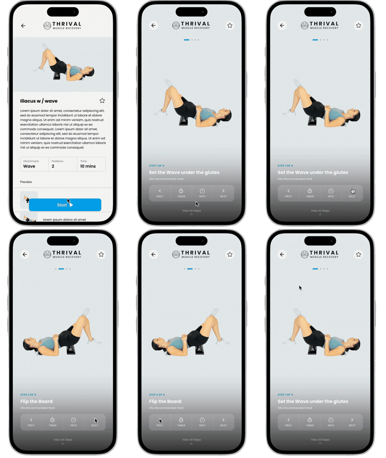
The first few iterations gave users too much information at once

Initial Design


Iteration 1

Iteration 2
Iteration and Refinement
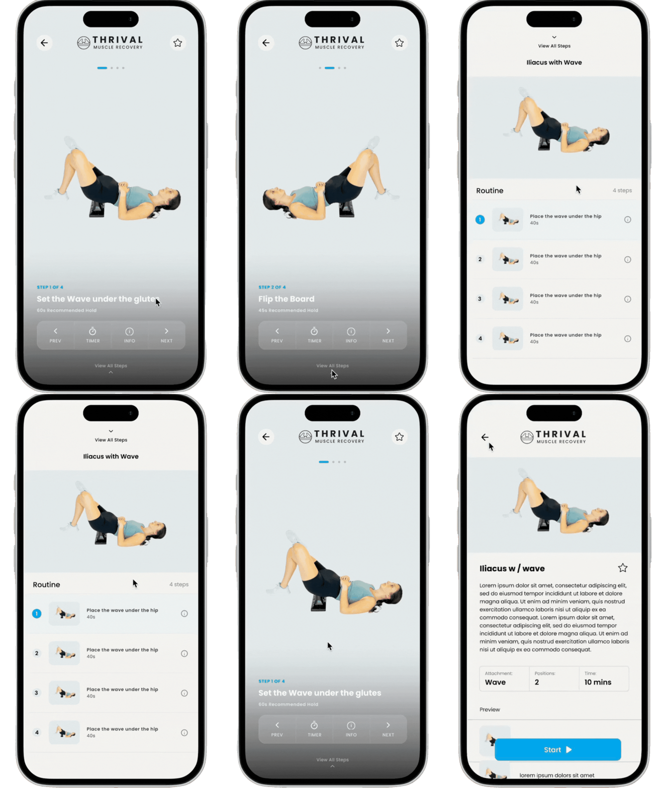
My first redesign added clearer instructions, timing, and easier access to the full routine. Stakeholder feedback pointed out that the exercise video was still too small and the screen felt crowded.
Prioritizing User Needs
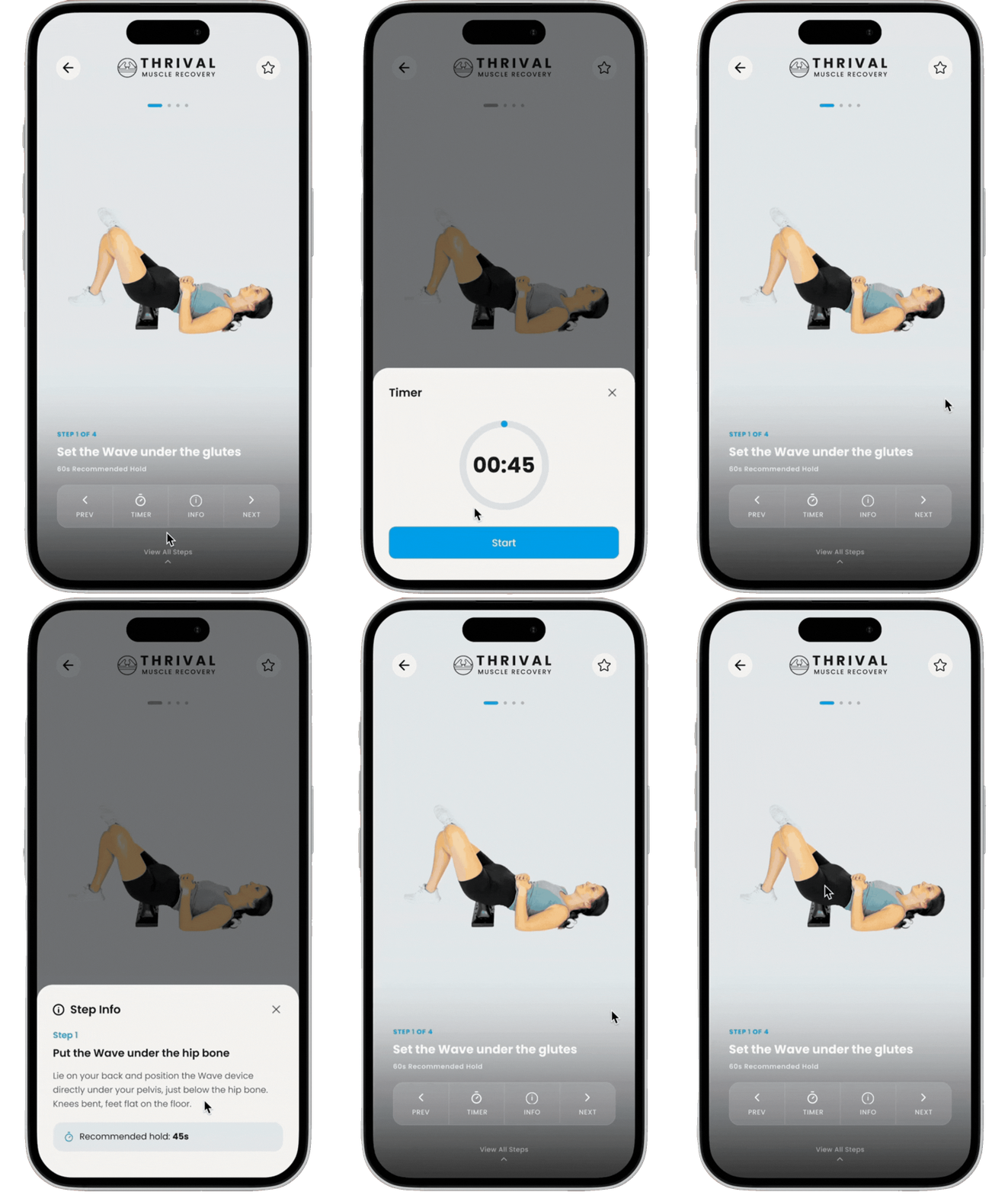
I enlarged the exercise video and simplified the screen so users could focus on the current movement/core feature as opposed to extra optional features.
Learning the importance of Design Hierarchy and Information Architecture
Features always visible
- Current step + progress
- Exercise name
- Recommended hold duration
- Previous / Next navigation
Available On Demand
- Timer
- Detailed step instructions
- Full step-by-step routine
This kept the primary screen focused on the routine itself while still giving users access to deeper guidance whenever they needed it.
06 / Business Growth
Designing new ways for Thrival to grow beyond product sales
Creating a foundation for creator content
Thrival also wanted to explore a future model where fitness creators could contribute content to the platform and participate in a business relationship with the company.
I established the product foundation needed to represent creators and exploring a social media aspect for the app. This will probably be something implementing within the future of the Thrival app as the stakeholders would need to focus on recruiting and partnering with creators first.

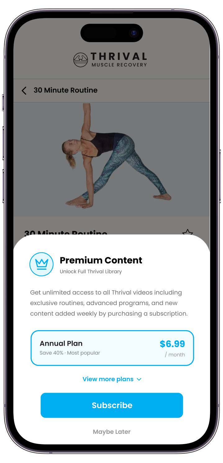
Exploring subscription monetization
Leadership also wanted the app to eventually generate recurring revenue beyond physical product sales.

My Solution
A tiered subscription structure with multiple billing intervals, informed by subscription patterns used across adjacent fitness products.
Outcomes & Reception
Launching the redesign in the app store
From design to launch
I worked with stakeholders and the developer to refine, approve, and launch the redesign. I kept approved designs organized in Figma to support development and ongoing updates.
Early Results
Thrival Muscle Recovery launched in the App Store, with early reviews highlighting helpful videos, easy navigation by body area, and saved routines.

Key Takeaway
What did I learn?
Redesigning and rebuilding Thrival has taught me how much product design depends on strategy and turning broad business goals into clear, usable experiences. Many of the ideas I received started as simple high-level requests but the real design work came from figuring out how those ideas should connect, what information users actually needed, and how much complexity the interface could support.
Key Takeaways
More isn't always better
My first guided-routine redesign made more information visible, but it also created more competition on the screen. The final direction taught me to prioritize the active task and move secondary information into on-demand views.
Iteration and understanding is crucial
The project reinforced that an early direction does not have to be perfect. Feedback helped me identify where my first ideas were too dense or too close to the original experience and gave me a clearer path forward.
Design doesn't stop in Figma
Working in a continuous review and handoff cycle with developers and stakeholders has shown me how design decisions carry into a live product. I learned to think more about consistency, implementation, and how each feature fits into the larger system.